I was fortunate to finally get a Nikon D800e (36 Mpx) after a brief 3 month wait. I didn't, and I also think its the same with Nikon, expect that there would be such a huge demand for this camera. I don't know why Nikon seemed to leap so far ahead with its next generation but I'm grateful. I think there are millions (well a whole bunch anyway) more who also think the same.
This is a full frame camera and a DX lens will work but is cropped due to limited image area. The camera even has mode where it will auto detect a DX lens and crop accordingly. Knowing that there is still a little more image available with the DX crop I decided not to crop and use whatever was available.
Nikon
D800e with 70-200mm f2.8 VR. The image on right is actual size of
window pane
My favorite DX lens is the 18-200mm f3.5 VR and as I travel around I notice others who like this lens. While it may have some pincushion and barrel distortion, thanks to Photoshop lens correction, this is almost all eliminated.
Nikon
D800e with 70-200mm f2.8 VR set to 1.2 crop. The image on right is
actual size of window pane. I didn't realize at first that the crop
factor also applied to FX lens.
It was while I was performing a resolution test with my D300 and the new D800e by using both the 18-200mm f3.5 VR and the 70-200mm f2.8 VR that I noticed that when full zoomed on the DX lens that vignetting seemed to disappear, but looked like a dime at 18mm.
This excited me more than the current test and therefore I decided to pursue this further.
The 18-200mm is really like a 24-300mm on a DX camera due to the 1.5 crop factor and this range will meet about 90% of my needs. With a 1.4 teleconverter on the FX camera it's now almost the same range as on a DX camera.
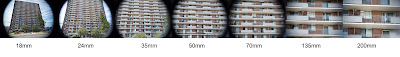
The test I performed was hand-held as I didn't need with this test to check for perfect resolution. I stood in front of a large apartment building in the parking lot across the street and remained at the same position while I changed the lens focal length.
In the 1st test, see film strip below, there is significant vignetting in the 18mm and slowly reduces as the focal length is increased. Even at 200mm there is still slight vignetting at the corners.
When the teleconverter was added then magic seemed to appear. At 18mm there is only slight vignetting at the corners and disappears by 24mm. The film strip below shows the changes with teleconverter added.
Now a favorite lens becomes useful on my full frame camera.Most lens that have such a wide range of focal lens is all about compromises when being designed and built. The same with the 18-200mm f3.5 VR. Photoshop easily handles the barrel distortion. But this lens at the glass edge, maybe more is being used now, also has a fair amount of chromatic appellation. This is also handled well with Photoshop. Since most artistic images don't need to be sharp or well defined at the corners of a photograph then any additional distortion caused by using more lens area is not really a problem with digital-editing.So when and if you do decide to go full frame one day then your DX glass can be useful with a teleconverter.The reason this works is because the lens is now further from the sensor and therefore increases in size on sensor chip. Take a magnifying glass and hold it to show an image appearing upside down on a piece of paper. Now move the magnifying glass further away and watch how the image on the paper grows larger. The same happens with a teleconverter attached.
Niels Henriksen


